CATEGORY: Mobile & Web, UI/UX Design, UX Copywritting
SOFTWARE: Figma
SERVICES: UI/UX Design, UX Copywritting
WEBSITE: *While this site is currently live, it was created under a white label design agreement and cannot be linked.
01. The Challenge
When a large scale resource management company approached us, they were at a crossroads. Their traditional brand identity, full of industry jargon and outdated visuals, no longer resonated with their target audience—cities and municipalities across the USA. The client recognized the urgent need for a rebrand that would position them as an innovative and environmentally friendly leader in the industry. However, there were significant challenges:
- Styling Rebrand: The client needed a fresh, modern look that reflected their forward-thinking approach but struggled with moving away from their established image.
- Environmental Perception: They wanted to be perceived as a champion of sustainability, a difficult shift for a brand previously associated with traditional resource management.
- Innovation Demand: The client sought a solution that was not just functional but also innovative and visually compelling.
- Target Market: With a focus on marketing their solutions to cities and municipalities, they needed to connect with decision-makers in a way that was both accessible and engaging.
- Resistance to Change: The client was hesitant about changing their copy and design, fearing that moving away from industry-specific language would dilute their expertise.
02. The Solution
Our approach was to blend cutting-edge UI/UX design with strategic copywriting that communicated the client’s expertise while making their offerings more accessible. Here’s how we did it:
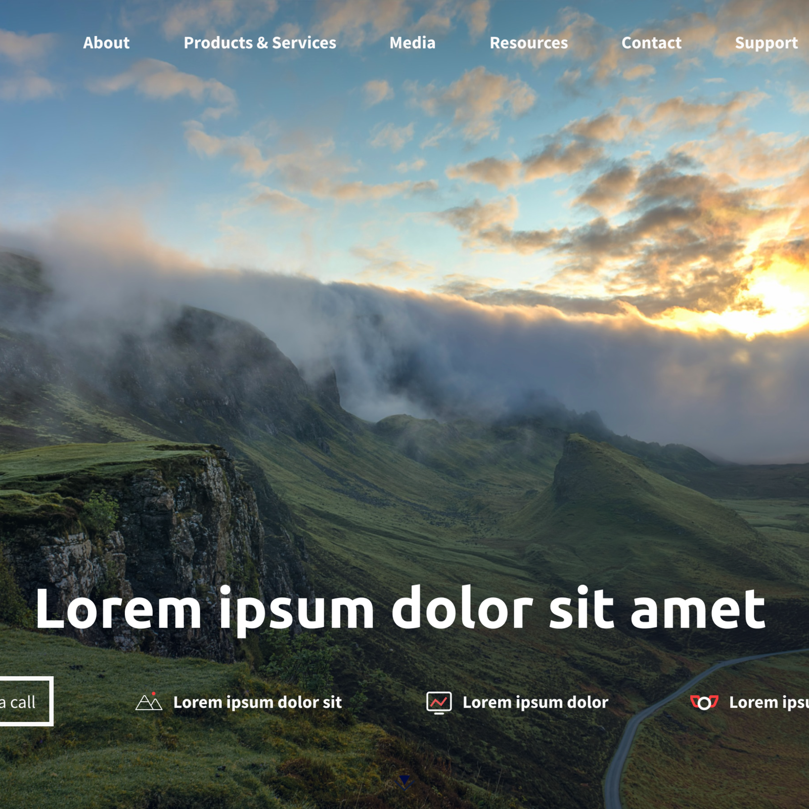
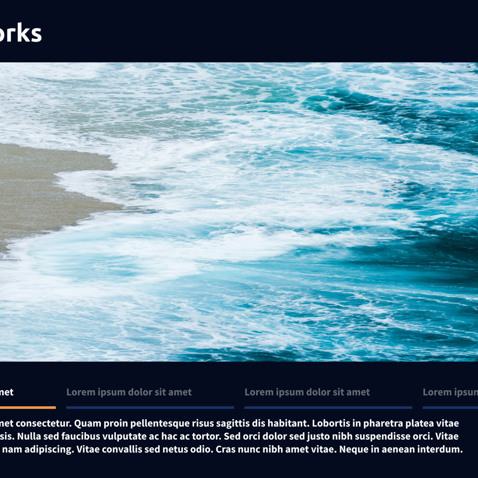
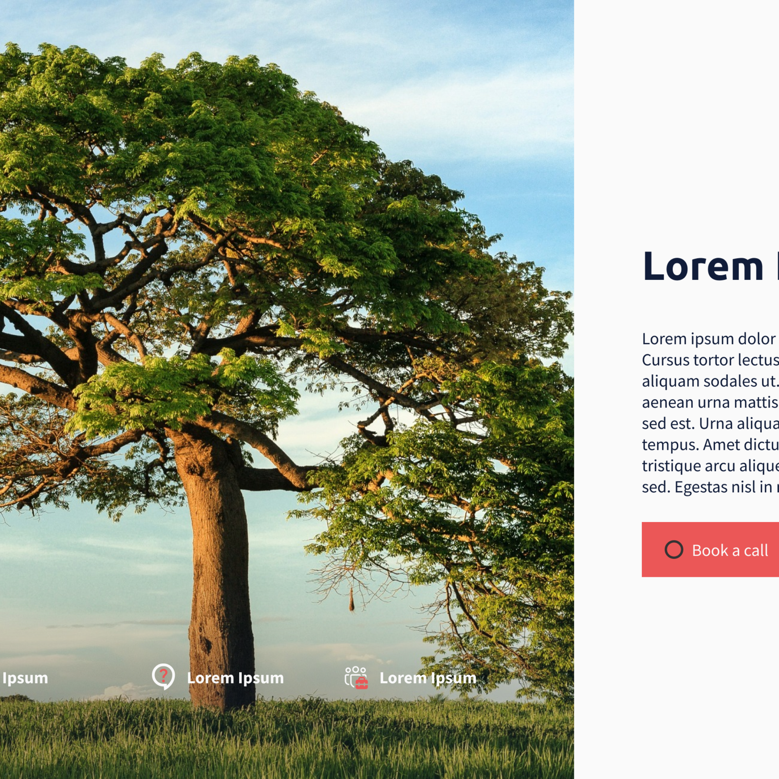
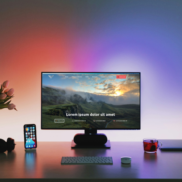
Modernized UI/UX Design: We developed a sleek, intuitive interface for both mobile and web platforms. The new design was not only visually appealing but also significantly improved the user experience, making the site easier to navigate.
Jargon-Free Copywriting: We overhauled the existing copy, removing industry jargon to make the content more relatable to municipal decision-makers who may not have specialized knowledge in resource management. This approach broadened the appeal of their services, making them more approachable without sacrificing authority.
Sustainability-Focused Visuals: To align with the client’s goal of being seen as environmentally friendly, we incorporated visuals that highlighted sustainability. This included imagery and infographics that demonstrated their commitment to green practices and sustainable solutions.
03. The Result
The rebrand was a resounding success, leading to a transformed digital presence. We created:
Innovative UI/UX Design: The client’s new website offers a modern interface that was both functional and aesthetically pleasing. The design was seamlessly integrated across both mobile and web platforms.
User-Friendly Navigation: The site’s improved structure made it easier for users to find relevant information quickly, enhancing user satisfaction and engagement.
Relatable Copy: The new copy struck a perfect balance—simple enough for the average user to understand yet authoritative enough to maintain the company’s industry credibility.
By embracing change and trusting our design and copywriting expertise, the client not only modernized their brand but also positioned themselves as an innovative leader in sustainable resource management. This project showcases the power of a well-executed rebrand in helping companies stay relevant and competitive in a rapidly evolving market.
At Criterion House, we specialize in creating user-centric designs that not only meet our clients’ needs but exceed their expectations. Whether you’re looking to rebrand or launch a new product, our team is here to help you every step of the way.


