CATEGORY: Mobile & Web, UI/UX Design, UX Copywritting
SOFTWARE: Figma, WIX
SERVICES: UI/UX Design, UX Copywritting
WEBSITE: selahretreatbb.com
01. The Challenge
We love working with small businesses to provide their users with a customized luxury UI/UX experience. So, when a local guesthouse with incredible customer reviews approached us about re-designing their website with UI/UX best practices in mind. We were thrilled to tackle the challenge. Creating a custom small business UI/UX web design. As we often find with small businesses all their design had been completed in house and they were finding that the current design wasn’t resonating with customers. In fact, after they had redone their website themselves, they experienced a drastic drop in conversion from their previous design.
The challenges were:
- Website UX Copywritting – Their Copy was lengthy, not easily scanable by the user and didn’t highlight their unique selling proposition. Leading to confusion for customers as they were unsure what was and wasn’t covered in their package.
- UI/UX Design for Navigation and CTA’s –The design was not useful for the user. Information was difficult to find and required a lot of reading for the user. Navigating through the booking process was not clear, and the CTA’s didn’t direct users to the most important information.
02. The Solution
Our solution was to simplify the site so that users clearly understood what made this guesthouse stand out from others in the area.
Looking through customer communication and reviewing the clients mission statement we refined their message down to the simple yet profound statement of Pause, Reflect, Refocus. Highlighting the key values of providing a peaceful place of rest for their guests.
Here’s how we did it:
1. Refined, Focused Copywritting – Taking the essence of their previous copy we refined it down to the core principles that would resonate with their customers. We rewrote their biography to highlight their experience and to highlight the elements that previous guests had found impactful about their stay.
2. SEO focused writting –Adding SEO focused keywords into the copywritting we ensured that google would easily index these pages for the needed keywords and helping the company rank above their local competition.
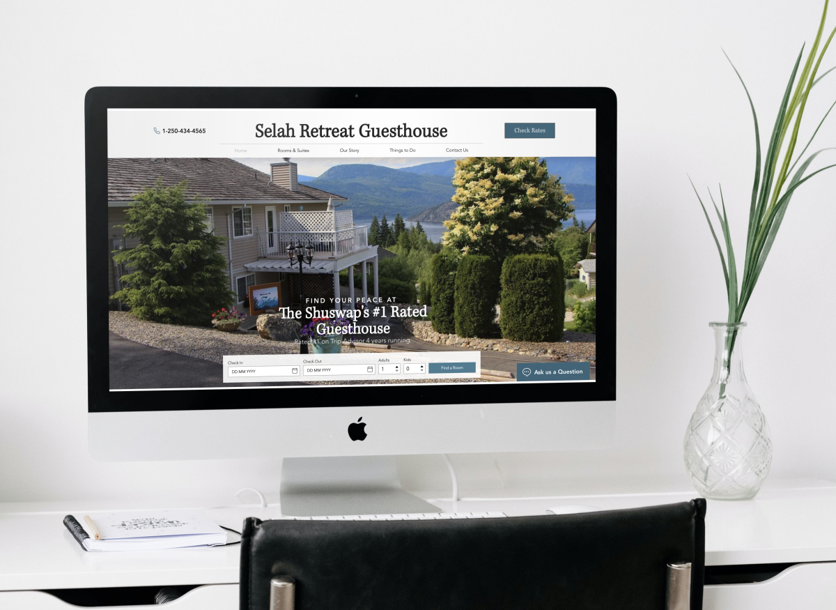
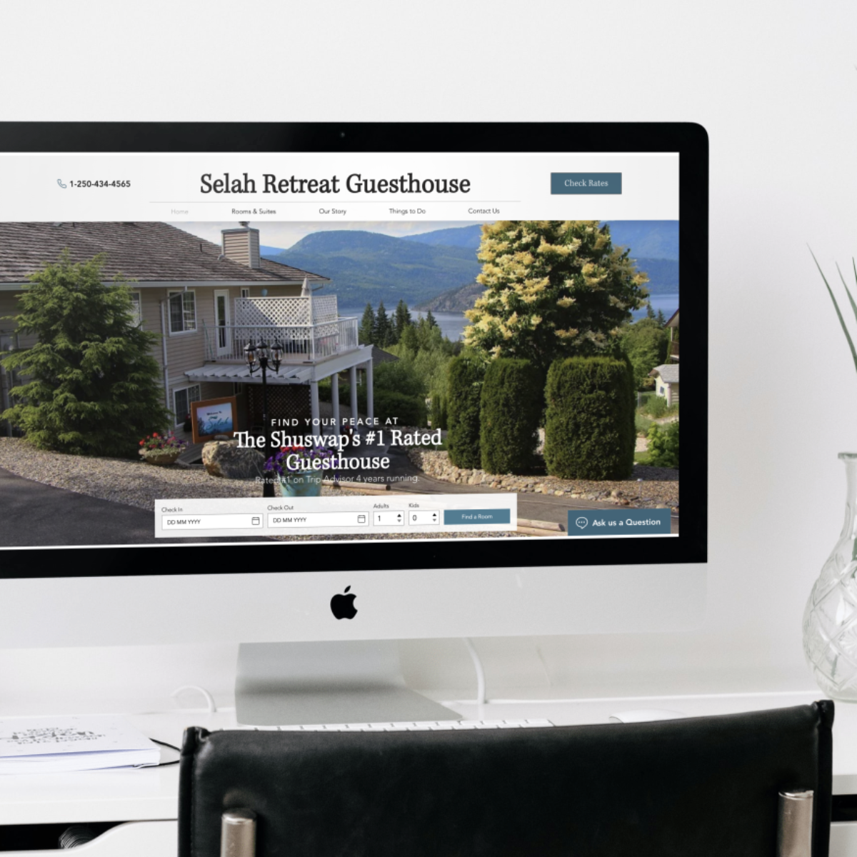
3. Improved UX – Providing the users with an updated navigation, centralizing vital contact information and moving the key information (ie. room information, highlighted features and important policies) to the homepage. We made it easy for users to find the information they were looking for. Creating pages that were easily scannable we also made sure users would be able to compare the different room offerings to make the choice that was best for them.
4. Transformed UI Design – To start, we selected a simple white colour palette for the site that would subconsciously communicate the clients expert cleanliness and attention to detail.
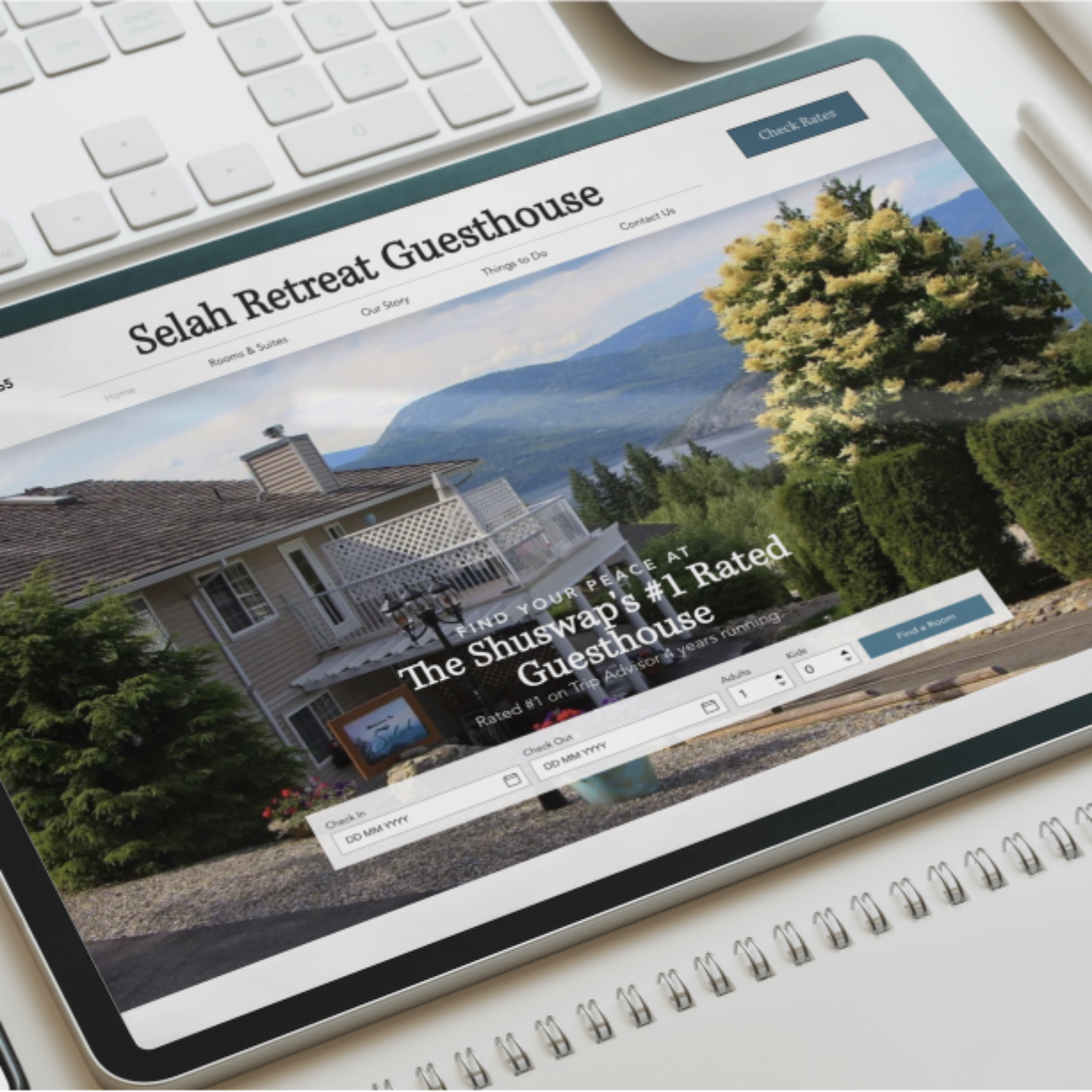
Then, with a redesigned navigation and appropriately placed CTA’s we redesigned the user flow through the site, making sure it was easy to use and beautiful to look at. Next, we used visual hierarchy to draw the users attention to vital information about their stay. Finally, we removed excessive text that was not being read by the user to communicate features and we replaced them with imagery that would catch the users eye.
03. The Result
The redesign was a resounding success, the client loved the changes and felt that they clearly articulated their core message and highlighted their unique selling propositions (USP).
The redesign offered the client a user friendly experience while modernizing their interface and keeping things aesthetically pleasing.
Their site is not optimized for both mobile and web, and within the first week they were already seeing an increase of inquiries through their new and improved “ask a question” chat button.
By embracing change and trusting our design and copywriting expertise, the client not only modernized their brand but also positioned themselves as the most peaceful, restful location to stay in the Shuswap area.
This project showcases the power of a well-executed redesign partnered with expert copywritting to engage users and drive conversion.
At Criterion House, we specialize in creating user-centric designs that not only meet our clients’ needs but exceed their expectations. Whether you’re looking to rebrand or launch a new product, our team is here to help you every step of the way. Let’s connect to see how we can help create a custom small business UI/UX web design for your company.

