CATEGORY: Design
SOFTWARE: Figma
01. The Challenge
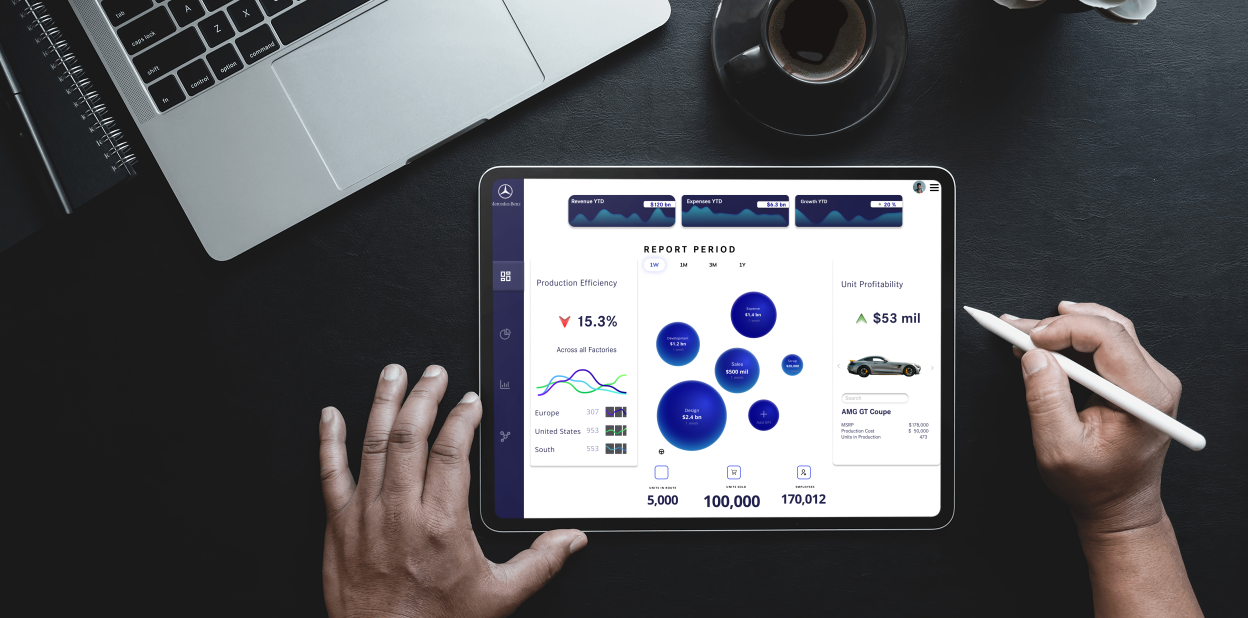
Imagine you work for a famous automobile manufacturer (like the one with 4 rings, for example). Your design team has been asked to work on their internal software design. This software tracks the performance of different departments and includes various KPI charts. Use your favorite tool (Figma, Abode XD, etc. – you name it!) to create a prototype for a dashboard featuring 3 different KPI charts. This dashboard serves as a landing page for managers and executives and helps them oversee the performance of various departments within the corporation. You were not provided a lot of guidelines for this project except for one – do not limit your creativity! Go as crazy as you possibly could with your design to ensure it is intuitive, user-friendly, and most importantly – INNOVATIVE and FUTURISTIC!
02. The Solution
We created a dynamic dashboard that featured 3 different KPI charts (Production Efficiency, Revenue to date and Unit Profitablity). With an innovative focus the dashboard allowed for quick review of reporting based on country of sales, revenue, or model type. The solution is user friendly and easy for the company to quickly review their profitability, visualizing cost savings opportunities and saving senior management significant time to pull the needed KPI data.
03. The Result
While they dynamic nature of this dashboard made for a more complex design (ie. the 3 KPI charts). We provided a design that was futuristic and innovative, meeting the design requirements and while making it possible to save the manufacturer time and money with high quality UI/UX design.


